Basic Color Curves in Bree Photo
Note: Screenshots in this tutorial may show GIMP branding, but all menus, tool names, and keyboard shortcuts are identical in Bree Photo and the steps can be followed directly.
Curves is a powerful tool for adjusting image tones and color. Although the interface is shown in Bree Photo, the principles of RGB curve adjustments apply to most image-editing programs.
Pixels and Color
Every pixel on the screen is a combination of Red, Green, and Blue. In 8-bit mode, each channel has a value range of 0 - 255:
- All three channels at
255→ pure white - All three channels at
0→ pure black - All three channels equal → a shade of gray (for example,
128,128,128is middle gray)
Keeping the proportions of the three channels unchanged while changing the overall brightness makes a color lighter or darker without changing its hue.
Curves: Value (Luminance)
Choose Colors → Curves to open the Curves dialog. By default the Value curve is shown:
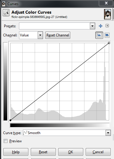
The bottom of the dialog represents the current brightness values of the pixels; the left side represents the new brightness values they are mapped to. Dragging the middle of the curve upward brightens the midtones:
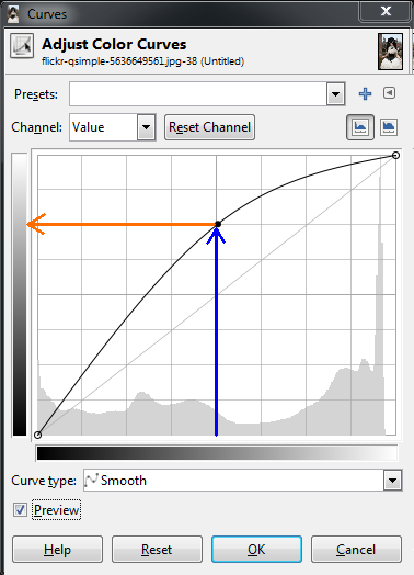
For example, pixels originally around brightness 128 are mapped to roughly 192.
A more common adjustment is a gentle S-curve: darks become darker and highlights become brighter, increasing overall contrast:
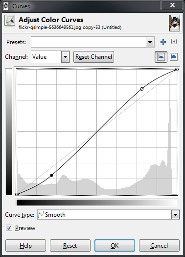
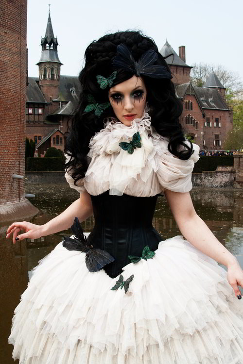
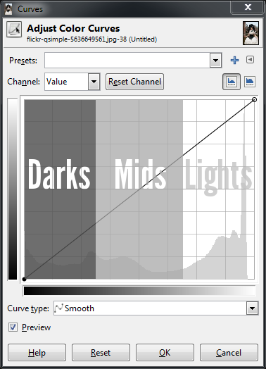
The diagram below can help you understand which parts of the curve correspond to which tones in the image:
Curves: Color Channels
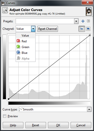
Use the Channel drop-down to switch to the Red, Green, or Blue channel:
On the color wheel, each channel has an opposite color:
- Red → Cyan
- Green → Magenta
- Blue → Yellow
Pushing a curve upward increases that channel’s color; pulling it downward increases its opposite color.
Example: Blue in Shadows, Yellow in Highlights
To make shadows cooler and highlights warmer, create a reverse S-curve in the Blue channel: pull up in the shadows to add blue, and pull down in the highlights to add yellow.
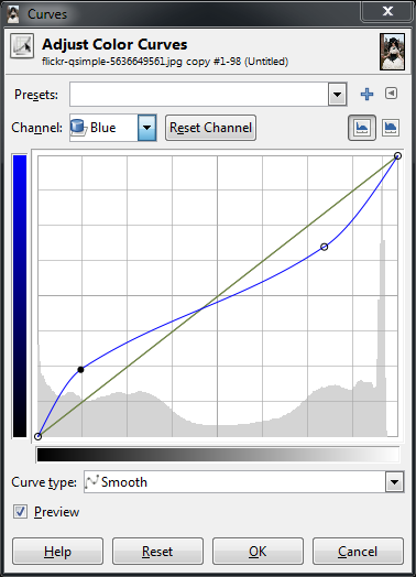
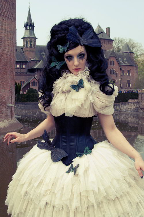
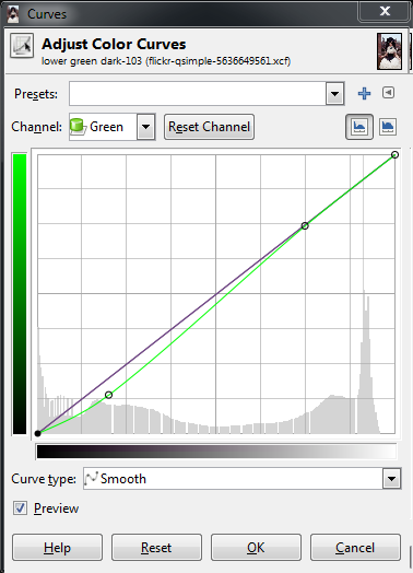
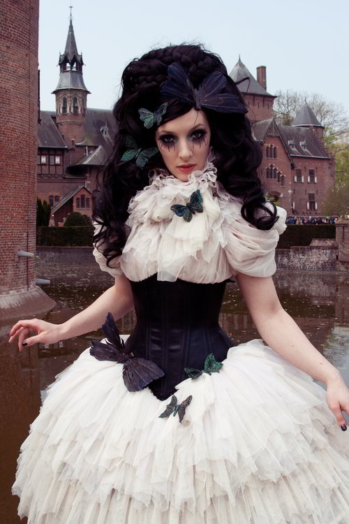
Similarly, lowering the Green channel in the shadow area adds magenta:
Color Grading Example: Teal and Orange
The common “teal and orange” look in films keeps skin tones leaning toward orange/pink and shadows leaning toward teal/blue. In the Blue channel, pull up the low-to-mid tones to add blue and pull down the highlights to add yellow; in the Red channel, pull up the mid-to-highlights to add red, giving skin a warm tone.
Note: The adjustments in this tutorial are deliberately exaggerated to make the effect easier to see. In actual use, keep them subtle and restrained.
Source & License
This tutorial is adapted from Pat David’s Basic Color Curves, licensed under the Creative Commons Attribution-ShareAlike 3.0 Unported License.